Context of the project
Aimee found me via my content on Instagram and was keen to get her first membership off the ground. She did some initial work on building her sales page, but then sought me out to complete the whole membership funnel, as she was short on time and frustrated with the learning curve of trying to figure out FEA Create herself.
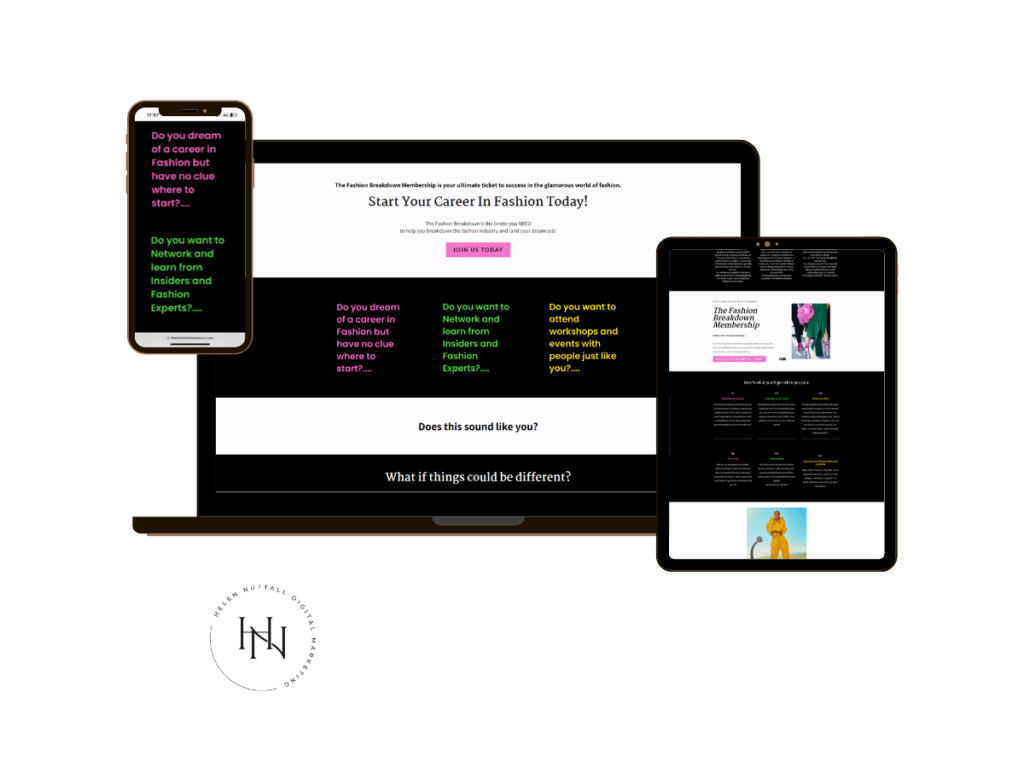
Aimee needed me to take what she’d already created and move it closer to what she envisioned the sales page and branding to look like. She was done with fighting with image alignment and getting the fonts to look as she wanted.
Premeet – goals and vision for the project
As standard, I offer a pre-meet that covers everything from ideal client, to goals and vision for the look of the project. This allowed Aimee (and all my clients) to express their ideas and for me to get a feel for their passion and their vibe. It sounds a bit woo, but it really does help to capture these things, as a website, or in this case, a sales funnel, needs to be infused with their personality, passion and energy.
Here’s a breakdown of what we covered:
Vision for the Fashion Breakdown Membership
We started off by talking through what her vision for her brand was, because she felt her website wasn’t yet cohesive. Her niche, the fashion industry, is ultra-driven by branding so she was conscious she needed to get every page looking perfectly built.
Ideal client work
We dug deep into her ideal client and how they would behave when making buying decisions on her sales page.
Once we had nailed the vision, we moved on to how she wanted the sales page to look and followed my suggestions for condensing the copy and messaging, before I started to enhance the design of the page.
VIP day – on the day

What we implemented – membership funnel
Sales page
I customised the sales page first and Aimee worked with me throughout the day, giving me super-clear feedback, resulting in a sales page she loves!
It needed to be punchy, in-you-face, but short enough to capture attention and encourage her audience of 18-25 year olds to purchase the amazing membership she is providing.
As we worked, I optimised the sales page for mobile, as this is the device most of her audience uses.
Thank you page
The thank you page needed to also be branded to Aimee’s brand guidelines. I also added the copy that Aimee supplied and tweaked as she had ideas (similar process to the sales page)
Welcome email with login details
Within FEA Create, it’s possible to customise this, so I made suggestions for what she should include here from a strategic perspective, to not only welcome people, but to minimise customer service queries.
Automations
This saves Aimee time, as she can send out the login email automatically, when someone makes a purchase. Within FEA Create, the purchaser is tagged so she can send targeted, relevant emails to them, and also keep track of which offer people are purchasing.
SEO optimisation
To ensure Aimee’s sales page is visible to search engines in the quickest time possible, I entered SEO key words into the main sales page meta description, and URL. Any images I uploaded were also SEO optimised.
Offers and checkout
I created a customised branded checkout, which enables users to choose two options to purchase – either a yearly subscription or monthly. Within FEA’s dashboard, I created the offers in the back end, so they were available for checkout.
Tutorials
Aimee was conscious that she would need to edit her sales page, and other pages, so I provided her with key tutorials on how to do the key things she would need to do.
Results
Aimee was so happy to hire me for this project as then she could get things done to a deadline and share her offer far quicker, than if she had tried to DIY it.
Want to get the inside scoop? Why not join the list
Want to talk to me about creating your premium dog training website?
Get in touch and we can have a chat about what you need. I build websites on Squarespace, WordPress and versions of Go High Level, like Easy Peasy Funnels.
Want get on my email list, so you get notified when a new blog post drops or the latest news about my services?

Comments +