Are you a dog trainer? Thinking about creating a website to promote and showcase your services? If you’re looking for inspiration, you’re in the right place. This post will dive into 10 amazing websites for dog trainers and dog behaviourists. I’ll be digging into why they are so good also.
Dog on the Hill
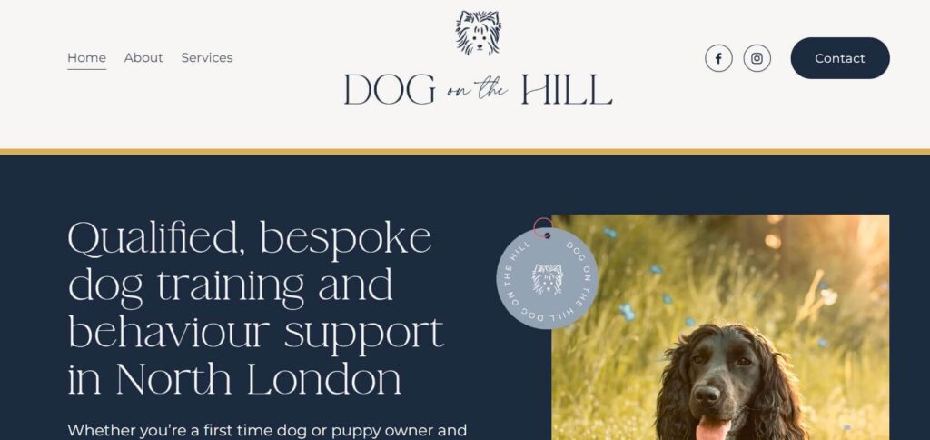
First up is Dog on the Hill. I love this website because not only is the branding gorgeous, but there are also ultra-clear ways to work with the trainer. The contact page is highlighted via a big button that stands out from the white background, so people are left in no doubt as to get in touch with the trainer.
The services she offers are divided into 4 clear categories, and you can also preview them on the About page.
Qualifications logo section and social proof
The home page design includes very important proof that the dog trainer is highly qualified, as well as a testimonial from a client, to build trust with new potential clients.
Contact page
Most buttons lead to the contact page. When you get there, you have 3 options. You can fill in the online form, or if you want to email directly, the email address is there.
The trainer has also added a business telephone number too.
I love this because it gives people choices and they can choose which they feel most comfortable with.
In summary – what I love about this dog trainer website
- Gorgeous branding
- Clear path to get in touch with the dog trainer
- Clear proof of qualifications and testimonials.
What I don’t like
- The top white section (header) is so big you can’t see the main section below it without scrolling down.
- The testimonial font is possibly too big to be easy to read, especially on mobile.
Louise Glazebrook
Louise’s site is up next – I’m in love with the gorgeous image she uses of the dogs on the homepage. It has a longer home page than some of the others I’ve seen.

What I love about Louise Glazebrook’s dog trainer website
- The minimal look and how powerful the photography is.
- The photography gives the site colour.
- The home page features her dog training services via minimal cute images of dogs.
What I don’t like
- The blog was hard to find
- The footer design is cluttered – it could be more minimal too
- The pages can take some time to load (on the screenshot, a couple of photos are missing)
Oroville Dog Training
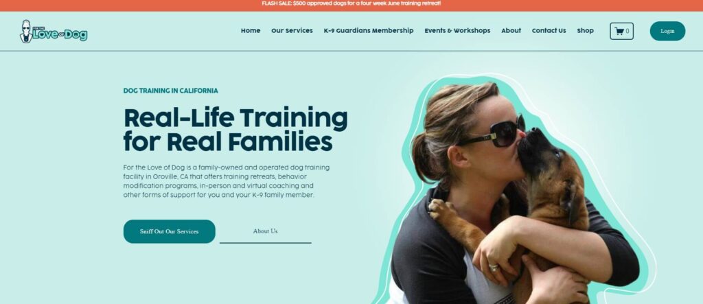
What I love about Oroville’s dog training website
https://www.orovilledogtraining.com/
- The bold but cute branding.
- The text is really conversational and friendly.
- It’s fun to explore the site and easy to understand what the services are.
- Video testimonials inside cute mockups
- A detailed but well laid out footer that pops a punch and gives people valuable info.
- People can book through Acuity Schedular for paid sessions, without contacting the team first.
- Love the moving banners and the movement in general of the website – it makes the experience even more exciting.
- They are offering a free training ebook in return for people joining their email list.
What I don’t like
- I felt they could have placed their qualification logos higher into the website, rather than at the bottom of the footer.
- There were two extra sections that I didn’t realise were there – making it too big in my opinion. I almost missed the opportunity to join their email list because of it.
Sean Hyden
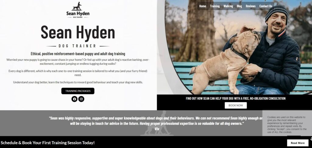
What I love about the Sean Hyden’s website
- The clean branding and design – minimal use of colour.
- The home page takes people and gives people the option of going straight to booking or finding out more about Sean’s services.
- He has a contact form on a separate page but also offers the opportunity to book a free 15-minute call through a calendar schedule embedded into the website.
- He uses the calendar schedular Calendly to book paid dog training sessions.
- His services page includes FAQs, who and where he serves, and cost of sessions, so people are more likely to book what they need. (This will save Sean time on emailing back and forth)
What I don’t like
The footer is a bit clunky and one link has slipped below the others.
The Dog’s Whiskers
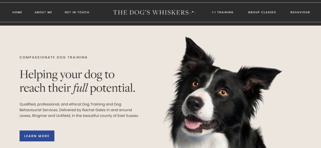
What I love about the Dog’s Whiskers dog training and behaviourist website
- The luxury look of the website
- The header section fits the screen without having to scroll so people are compelled to press the button to learn more.
- The home page features her dog training services via luxuriously branded images.
- Testimonials are sprinkled throughout the page but aren’t too big.
- There are clear steps on the home page guiding people on how to work with Rachel.
- Cute footer design
What I don’t like
There wasn’t anything I didn’t like about this site.
Fearless tails
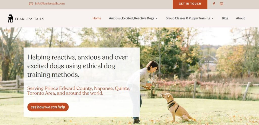
What I love about the Fearless tails website
- The clean look of the website – looks really legit and professional
- The header section has four options for people to contact the trainer: the buttons, email address and the chat function.
- I like the split menu and don’t think it’s confusing.
- The menu reassures people instantly as it highlights free blog posts that can help dog owners with anxious pets. This will build trust with the audience and encourage them to stay on the website for longer.
What I don’t like
- The black font was too dark and bold for me. (but I can’t help myself with my designer’s eye)
Happy Tails Dog Training
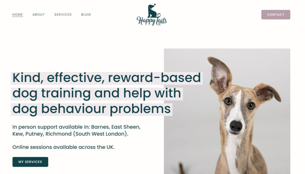
What I love about the Happy Tails Dog Training website
- The simplicity of the website – it’s really easy to read and digest the information.
- The menu is minimal and easy to use.
- The header section is so simple and communicates what they do.
- The home page introduces us straight away to the puppy school and how to book.
What I don’t like
There was nothing on this website that I didn’t like
Happy Go Puppy
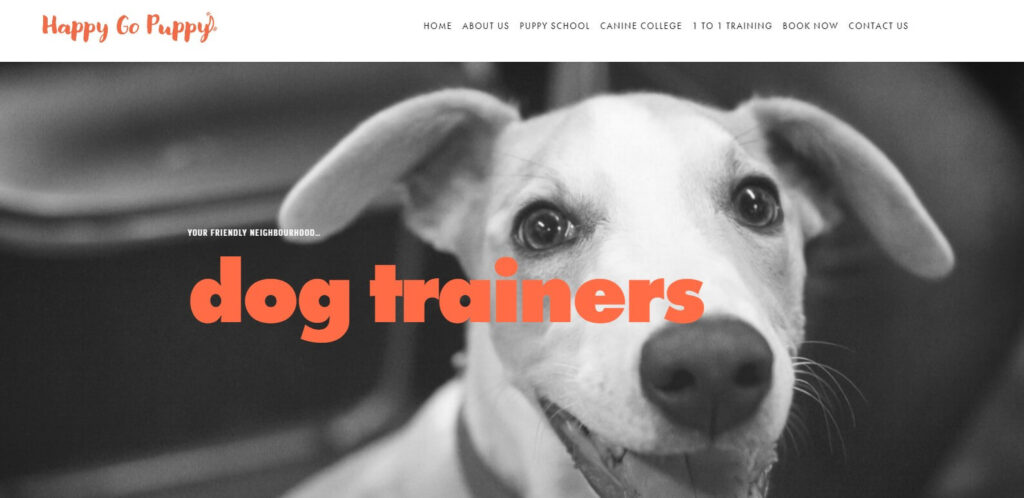
What I love about the Happy Go Puppy website
- The branding of the website – it’s bold and daring.
- The menu has a clear contact button so people can take the next step to booking.
- The header section is so simple and contains a great button that leads to Sorrel’s services.
- The home page introduces us briefly to the dog trainer, her qualifications, testimonials and does it without overwhelming us.
What I don’t like
- There needs to be a contact button on the main menu
- There are too many testimonials on the home page.
- The section about the trainer needs to be in the main body of the home page and not the sidebar – the reader could miss it. (It also looks cluttered)
Extremus dog training
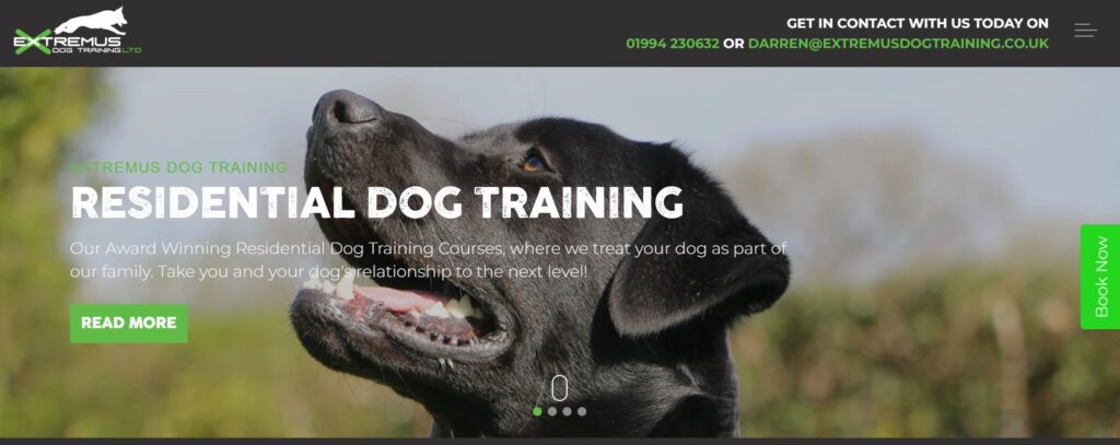
What I love about the Extremus website
- The branding of the website – it’s very hard-hitting
- The menu has a clear contact button so people can take the next step to booking.
- The header section is so simple and contains a great button that leads to Sorrel’s services.
- The home page introduces us briefly to the dog trainer, her qualifications, testimonials and does it without overwhelming us.
What I don’t like
- There needs to be a contact button on the main menu
- There are too many testimonials on the home page.
- The section about the trainer needs to be in the main body of the home page and not the sidebar – the reader could miss it. (It also looks cluttered)
West London Dog Trainer
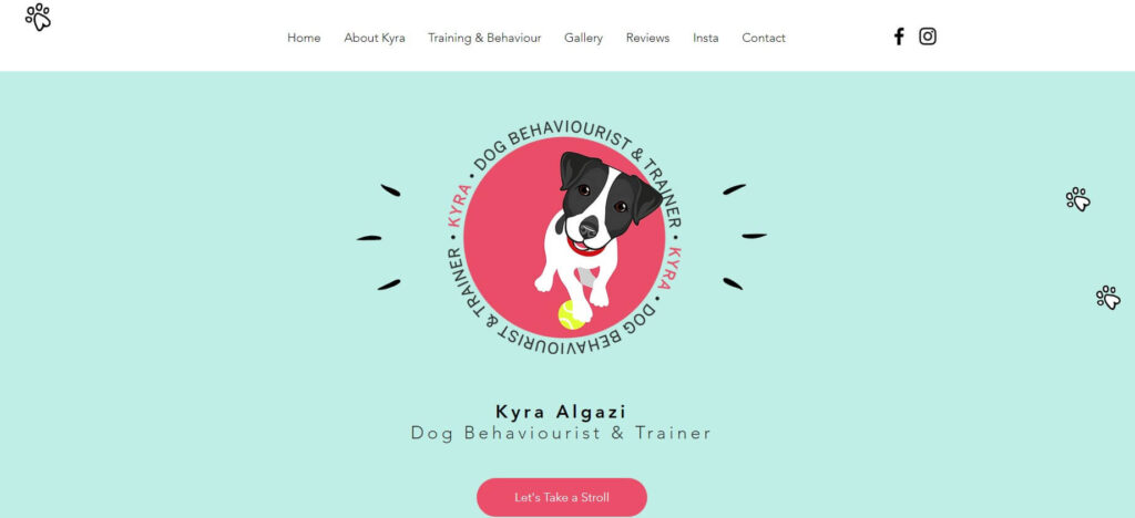
What I love about the West London Dog Trainer website
- The cute cartoon branding of the website links up the different sections.
- The home page takes people on a journey of getting to know Kyra and her services
- She has an embedded contact form on the home page that is the next natural step for someone wanting to work with her.
What I don’t like
- There needs to be more buttons to link to the contact form
- Personally I would have the contact form on its own page.
- I would also have a more in-depth separate about page. It seems like the website is based on one page and needs separating out so more people find her when searching online.
In conclusion
I hope this was useful for you if you are a dog trainer or behaviourist and you are thinking about having a website for your business. In my humble opinion, having your website is crucial in 2024 to have a home so people can learn more about how you can help their dogs and make the choice to work with you.
Want help creating your website? Don’t want to do it yourself?
Find out more about my website design services here
Want to talk to me about creating your premium dog training website?
Get in touch and we can have a chat about what you need. I build websites on Squarespace, WordPress and versions of Go High Level, like Easy Peasy Funnels.
Want get on my email list, so you get notified when a new blog post drops or the latest news about my services?
Comments +