Buttons are the lifeblood of your website. They make it easy for people to book your services or buy your products. So we need to make stand-out buttons to get your lovely audience to do the thing you want them to do.
How to add a button to your website: Squarespace tutorial using Fluid Engine
This tutorial shows you how to add a button to a section of your Squarespace website, and then style it. Watch until the end, because I demonstrate how to change the global styles section, so you are not having to design each button individually. Believe me, it will save you time.
Prefer to watch a video tutorial?
Watch and pause as many times as you implement using my Youtube tutorial here
(For Easy Peasy Funnels AKA Go High Level Tutorial for adding buttons – coming soon!)
If you wanted to know how to add a button to a Squarespace main navigation menu, click here for this tutorial
How to add a button to the top navigation on Squarespace
Step 1 – Edit
Go to the page you need to add your button to and click edit at the top left to edit your Squarespace website.
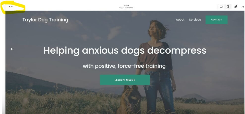
Step 2 – Choose button and position it
Click add block to section, then choose button. You can drag the button from the menu section to where you want it on the page. The brilliant thing about Fluid Engine editor is that it has a grid section and it allows you to move things a lot more than the old editor did.
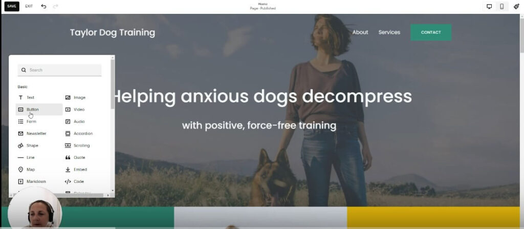
Step 3 – Edit the text and add a link
Double click on the button and Squarespace allows you to edit the individual button. Choose appropriate text for what you want dog guardians to do next (call to action).
Maybe you want them to book a free discovery call, or browse your services. Change the text section to suite and add the link you want to send them to, in the ‘attach link’ section.
Examples could be: Book a free call
Schedule a call
Contact me
You can use a link that’s outside your website like if you use Calendly for example. You can also link to internal pages within your website, like your contact page.

Step 4 – Edit the design of the Squarespace button
If you want to change the design, you can do by clicking on the design tab.
This is where setting global styles for your buttons (a style that you can use across your website) and 3 button types is useful for your website. It will save you time.
How to set global button types on Squarespace
This will save you time and energy when you are designing and is part of my process when I work on client websites.
Step 1 – Go into site styles on the right hand side of the editor
Use the paintbrush button to access the site styles within your Squarespace website.
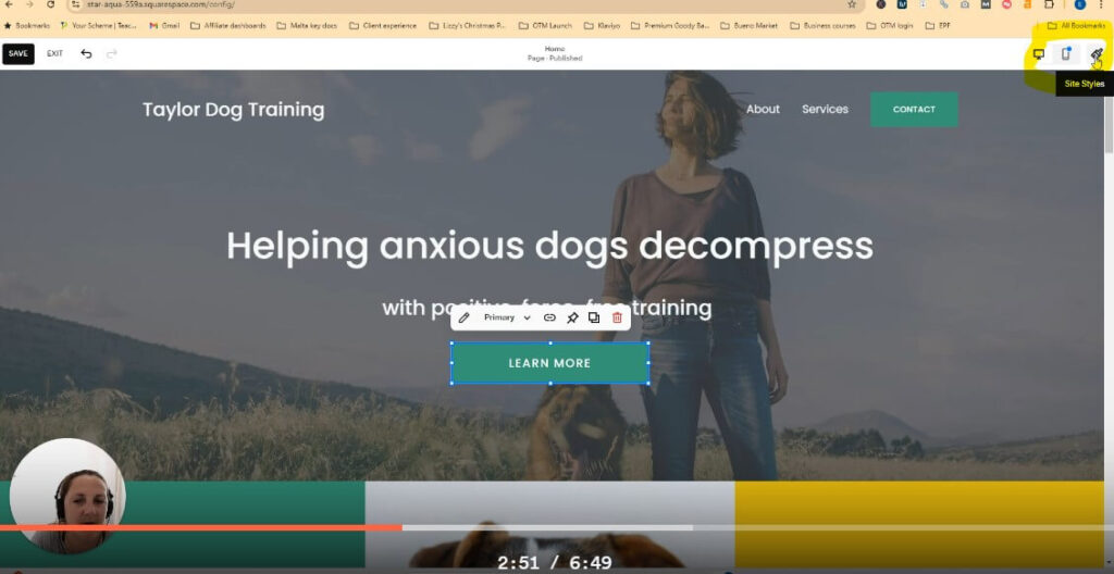
You will find options to edit 3 different button types and I suggest you create 3 different options for different background colours.
Step 2 – Set the designs of the primary, secondary and tertiary buttons
The site styles menu will appear on the right hand side of the screen as below.
Here I suggest you spend a bit of time adding your brand colour palette, fonts and then style the buttons once you have figured all this out.
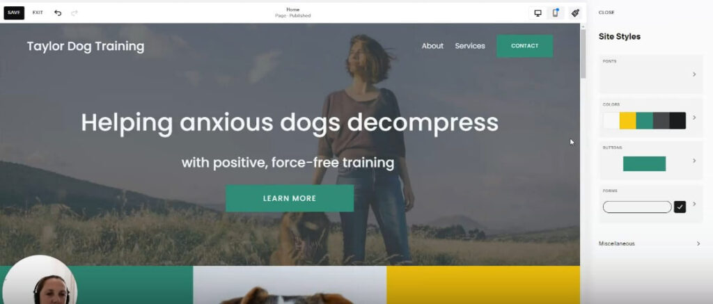
Step 3 – Style your buttons with colours, fonts and design effects.
There is so much customisation you can do with your buttons on Squarespace. For example, you can change the size of the corners, the entire shape of the button, or whether it is filled with block colour or not.
Check how the button appears on mobile view
This is always part of my process, and to be honest as I am building out a page, I will check the mobile view as I build each section of each page. So I optimise for people viewing on a phone as I build. Then it’s not a load of work at the end.
It’s most likely that the button won’t appear exactly how you want it to, so there are a few things you can do without affecting the desktop view you have built. If you are worried you will affect the desktop view, continue to check it each time you do something, and then you get an idea of what affects the view and what doesn’t.
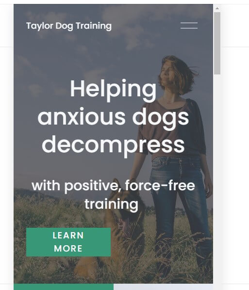
Before editing on mobile view
The button is skewed over the left and looks too thick so it looks off brand. So I made it longer by dragging the corner and then moved its position to the centre. (At this point, it’s good to check if anything has been affected on desktop, but it hasn’t so it’s good to save.)
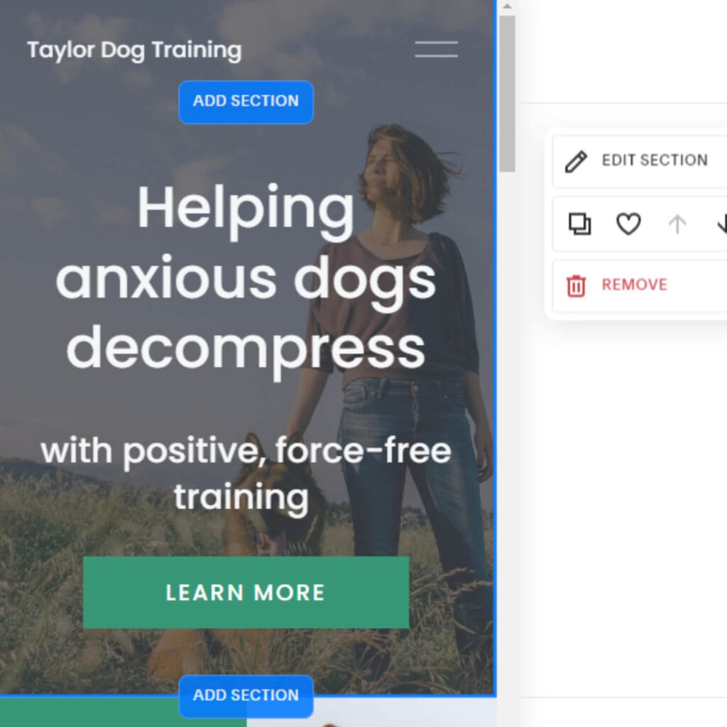
After editing on mobile view and checking that it doesn’t impact desktop view
As you can see the button looks on-brand again and aligned with the rest of the content on the screen. It looks like a higher quality design.
Hi it’s great to meet you!
I’m Helen, a highly experienced Squarespace and Easy Peasy funnels web designer, who loves to help dog trainers stand out in their space.
I have worked with and continue to work with many types of businesses, building websites for start up online businesses through to established fitness coaches, consultants, financial coaches, copywriters and wellness practitioners.
If you want to discuss a potential project, you can email on helen@helennuttall.co or get in touch with me here. Or, you can book in a free 15-minute consultation call here.
Comments +